My role:
This was a real client project. My partner Kendall Smith and I worked together for 4 weeks.
-
Product strategy
-
User Research & Analysis
-
Sketches
-
Wireframes
-
UI Design & Prototyping
-
Illustration/Icon design
-
Usability Testing
Tools:
-
Miro
-
Figma
-
Adobe Illustrator
-
Pen & Paper
-
Google drive
-
Wix website builder
-
Zoom
I always find starting a project interesting: I get to work with new people and learn about a new industry. I have felt excited about e-commerce UX since I started selling my art prints on Etsy. It was such a great experience that I wanted to create a web store myself. Now that I have become a UX designer, I finally had the chance to work with an e-commerce business owner.
About MilSO box:
Milsobox is a subscription box company dedicated to honoring and respecting the women holding down the home front, Milsobox sources gifts meant to excite, comfort, assist, and beautify our warriors at home.
Problem:
Milsobox currently sells one-time purchase boxes through their website built in Wix and subscription services via the Cratejoy site. Combining two sites for a user subscription flow was confusing for lots of users and it led to a low conversion rate.
MVP:
How might we improve the subscription user journey to increase sales?
Our Design Process
We started by setting up analytics and user tracking to better understand the struggles users face when getting familiarized with the Milsobox, locating a product or subscription services, and attempting to make a purchase.
Identify problems and/or opportunities in an existing e-commerce website and utilize our knowledge in designing a solution.
Note: For this case study, I am not going to cover all the pages of the website. I will be addressing the issues faced by the users to select subscription boxes and add their products to the cart for checkout.

Website Analysis
Cratejoy Analytics
February 2020 - February 2021
2565 Visitors
224 Entered Subscribe Flow
85 Reached checkout page
44 made a purchase
Wix website Analytics
March 2021
258 Visitors
86 Product views
11 Added to the cart
3 made a purchase

_edited.jpg)

Competitive Analysis
We analyzed multiple subscription service websites as well as other businesses that also had CrateJoy sites. We identify areas of improvement for the
MilSO website and MilSO CrateJoy site.
We wanted to:
-
Create a consistent design across the two sites, and link the sites both ways
-
Incorporate more images - our client has done an excellent job of photographing the products and boxes.
-
Make the CTA clear
-
Avoid having repetitive information/questions between the two sites
-
Keep images and content consistent across two platforms
One specific thing I figured is generally eCommerce apps keep things more simple and easy the more we proceed towards ordering anything successfully.

Existing subscription user flow
High user drop-off rate:
There were user drop-offs from the Cratejoy website page to the checkout page. There was a further dropoff of users on the Payment page. This leads to a low conversion rate.
Long checkout process:
The checkout process took a lot of time which also led to low conversion rates.
Clustered header design Confusing navigation system between two website

No clear information about the items in the box or subscription


Visuals and UI of the website
Inconsistency of typeface, font size, color, and background. Accessible-colors.com Webaim.org

.png)
Ideation
After detailed research about Milsobox and Cratejoy, we learned a few important things to improve the user experience of the website.
Together, my co-designer and I created an updated and improved, proposed subscription user flow for our client.

Initial Design
After organizing all the insights from the exploration phase, My partner and I started our design via Zoom video call. For this, the main tools we used were paper sketches.
When it comes to discussing different solutions and testing with real users, paper sketches can be really useful. Here you can see some of what we created during the Milso project.


Visual Design
Now comes the Visual Design Part of the website. According to the flow, the first thing a user views is the homepage and gets familiar in a short time. According to Adobe, 38% of online shoppers will leave a website if they find the design to be unattractive. And that’s the reason why we created the style guide that matches the aesthetics of products and the purpose of Milsobox subscription services.
Our wireframe approach was a little different from the traditional UX process. Our client Kristin was specific about using Wix to build the website. So we created a Hi-Fi wireframe in Wix to show how the Wix elements could come together to make the site. You can view the wireframes here.
Hi Fidelity Prototype
We decided to create a prototype in Figma. While creating the user interface, we paid special attention to the brand characteristics (feminine, mature, high-end, minimalistic, helpful) and the personas’ needs (sophisticated, unique, and caring).


User Testing
We conducted five virtually moderated usability tests on users who have subscribed to a monthly subscription service for themselves or their significant others.
Through our first round of user testing we were able to identify some key areas of improvement:
-
Users interacted with the website well but didn't understand the concept of the surprise box.
-
Discovered their pain points and learned the "SHOP" tab in the header menu was confusing for 4 out of 5 users.
-
Realized that Users expected more visuals of the subscription boxes.
One important thing, We learned that all the users were identifying this website as feminist and care products.
Design Improvements
After the first round of usability tests, My partner Kendall and I had some different ideas in mind. By collaborating in Figma, we shared our design and decided on the best UX that can help users find what they are looking for and enter the subscription flow.
We reorganized some visuals and added small details in the icons. ( using words like Surprise, Army, Navy, Airforce, etc.)
Removed the Shop page from the navigation bar, but kept the one-time purchase button. Directed users to enter the subscription flow and check out the page. Most importantly, Added the prices for subscription plans and one-time purchase boxes.
It was a challenging task for us to influence users to purchase the Milsobox without showing them all the items. Each Milsobox has a new theme every month and is thoughtfully curated with different products, what’s inside the box is a surprise.
After testing different ideas, we came up with the idea of adding a list of all the items possible that could be included in the box.
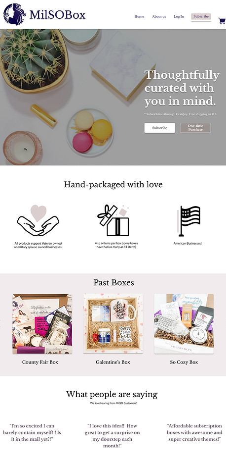
We added pictures of the past boxes and other users' reviews with boxes.
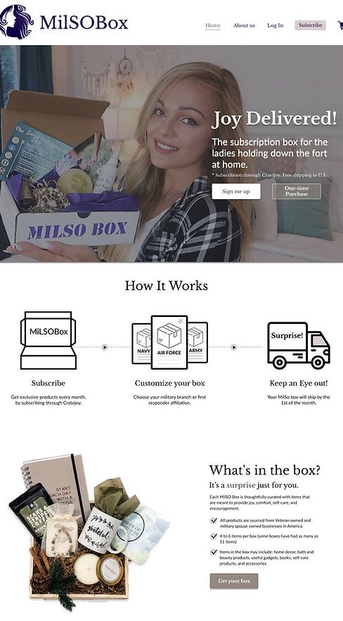
Milso Website Prototype

NEW HEADER
The header was reorganized and it's hierarchy was adjusted to better present the users' most common task "subscription"
HERO BANNER
Instead of using 2 columns, we use a Hero image that gives an idea about the box and matches the aesthetic of the website.
ABOUT THE PRODUCT
give customers an idea of what could be in their box but also make it clear that is a surprise box.
NOT SURE TO BUY?
For users who aren't sure if they want to receive a surprise box, it gives a clear list of items that could include in the box. And clear pictures with carousel effect.
EXPECTED PRICE
This section of the website was a game-changer. It was very helpful for all the users to know the prices upfront. and how they can save money.
ABOUT THE PRODUCT
By clicking on the partner tab, users can see the products were made by military spouses, veterans, and businesses of America.
PRODUCT REVIEW
Adding better visuals and reviews of the boxes, helped users to gain trust for getting the Surprise Milsobox.

Checkout process through Cratejoy
While designing for the Milsobox website, we had the freedom to change the design according to user needs. On the other hand, we had some limitations to change things on the Cratejoy website. We worked on improving the subscription user flow to make it more concise and clear for the user which led to positive results.


E-commerce Design
UX takeaways
All in all, I enjoyed working on the Milsobox website with a truly amazing partner! I learned a lot about both the subscription box businesses and e-commerce UX.
-
Research is a must – We couldn’t have designed a website our users love without the help of the people who will use it – it might sound like a cliché, but in good UX this always holds true.
-
Small things can make a huge difference – Changing the past boxes position or adding a “Subscription Box price table” doesn’t seem like big innovations, but they made user frustrations disappear. If uncertain, A/B testing can help in deciding such questions.
-
Communication is key – Working with a co-designer, it was important for us to be in constant communication. (phone calls, text messages, zoom video). Moreover, we follow up with the client every week and keep her in the loop to give a project update.
We got positive feedback from the client and she understood the real problem with the website and the low conversion rate for subscription flow. After checking all the designs and hearing user testing feedback, we recommended adding better product photography and avoiding asking extra questions during the checkout process.
You can see the final prototype here.
You can also reach out to me at designkikani@gmail.com to get an inquiry about this new Milsobox website launch!

We received April month's awesome Milsobox from the client.

